Naksha
AR Wayfinding
UX Researcher, UX Designer, UI designer
Project Overview
Train travel stands as the primary choice for long-distance journeys in India, embraced by the majority of the population. The Indian Railway Catering and Tourism Corporation (IRCTC), a significant public sector entity, plays a pivotal role in this domain, offering indispensable ticketing, catering, and tourism services for the Indian Railways.
At the core of IRCTC's mission is the seamless handling of online ticketing, efficient oversight of catering facilities, and the proficient management of tourism operations within the expansive railway network. Moreover, IRCTC extends its support through a dedicated mobile app, designed to cater to all aspects of a passenger's railway journey.
Our initiative delved into comprehending and enhancing the user experience while traveling by trains, specifically focusing on adding to the functionality of the IRCTC mobile app. The goal was to ensure that this digital platform aligns perfectly with travelers' needs, offering convenience, efficiency, and a seamless journey experience throughout their railway travels. My role in the team was to lead the UX research and collaborate with my team mates to conclude with the best UX practices and UI concepts for the project.
The Emerging Problem
Wayfinding in current Indian railway stations is challenging and confusing, leading to passengers frequently ending up in the wrong locations. They lack clear information about their train's arrival platform and distance, and struggle to locate the nearest washroom facilities, resulting in a subpar passenger experience. This is often the case for the new solo travellers and also the more experienced traveller but is prevalent for the younger generation as they opt for train travel and a more pocket friendly mode of travel.
Project Goals
To start and direct our research objectives and methods we came up with a few set goals to help understand the key focus areas and customer/user needs.
Build on top of the current IRCTC App
Create a seamless integration from booking, planning to getting to the train seat
Create a good train boarding experience for passengers
Use technology to help in way-finding at a train station
Research Goals
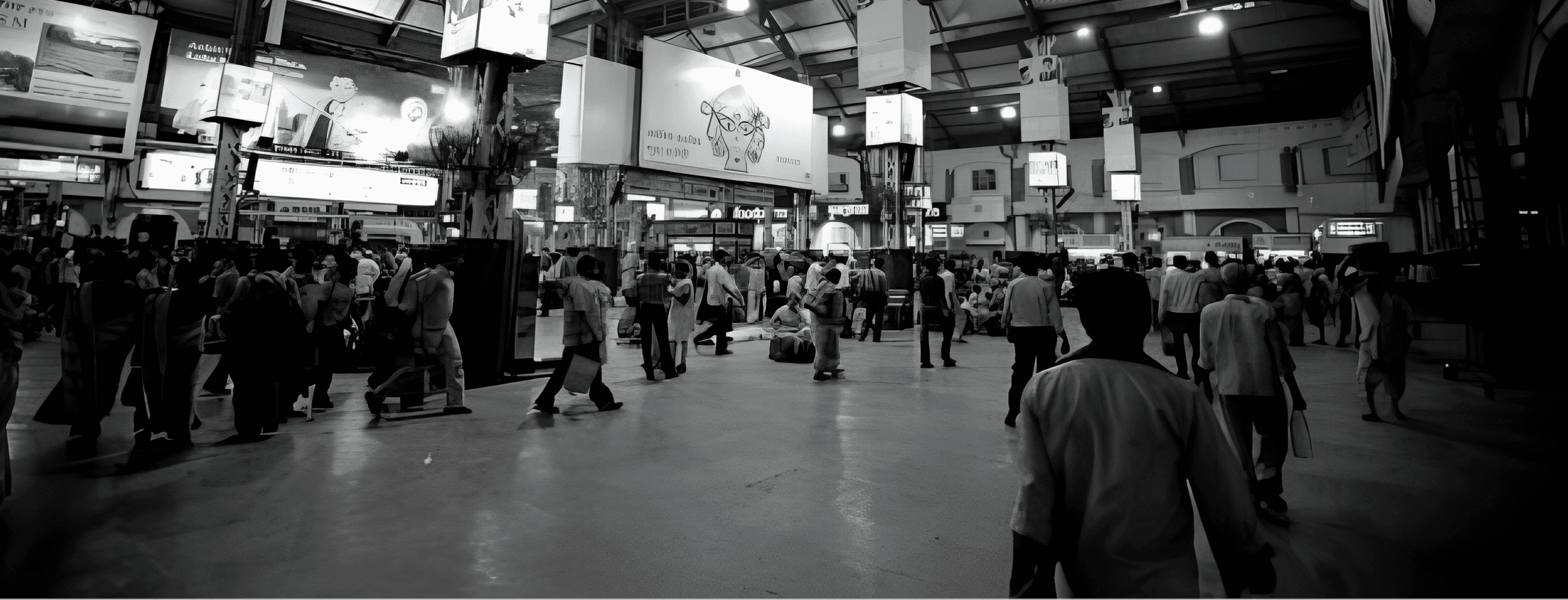
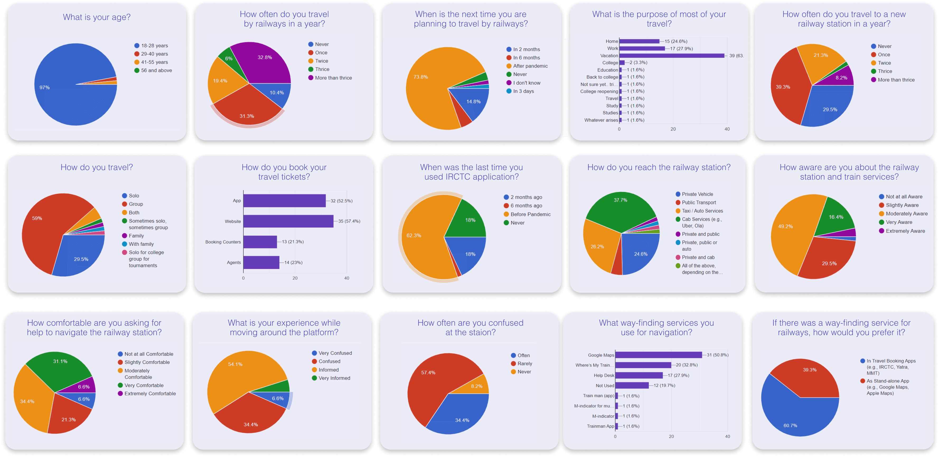
Due to Covid-19 we couldn’t see multiple stations but we picked one to get all our first hand observations and insights. The user set for survey and interviews ranged from backpackers to non-frequent travellers, to understand their needs, motivations and frustrations to help shape the app.’
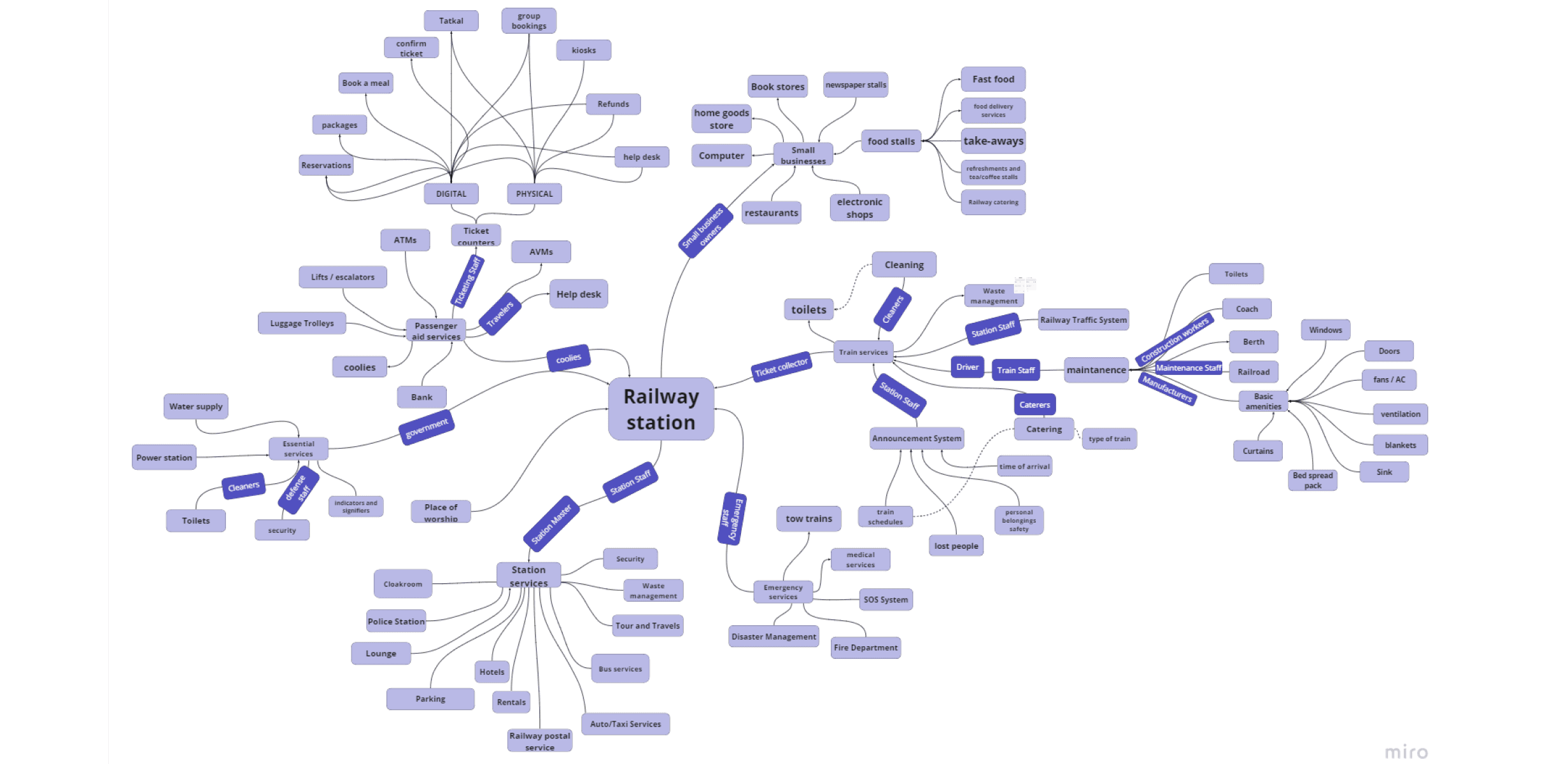
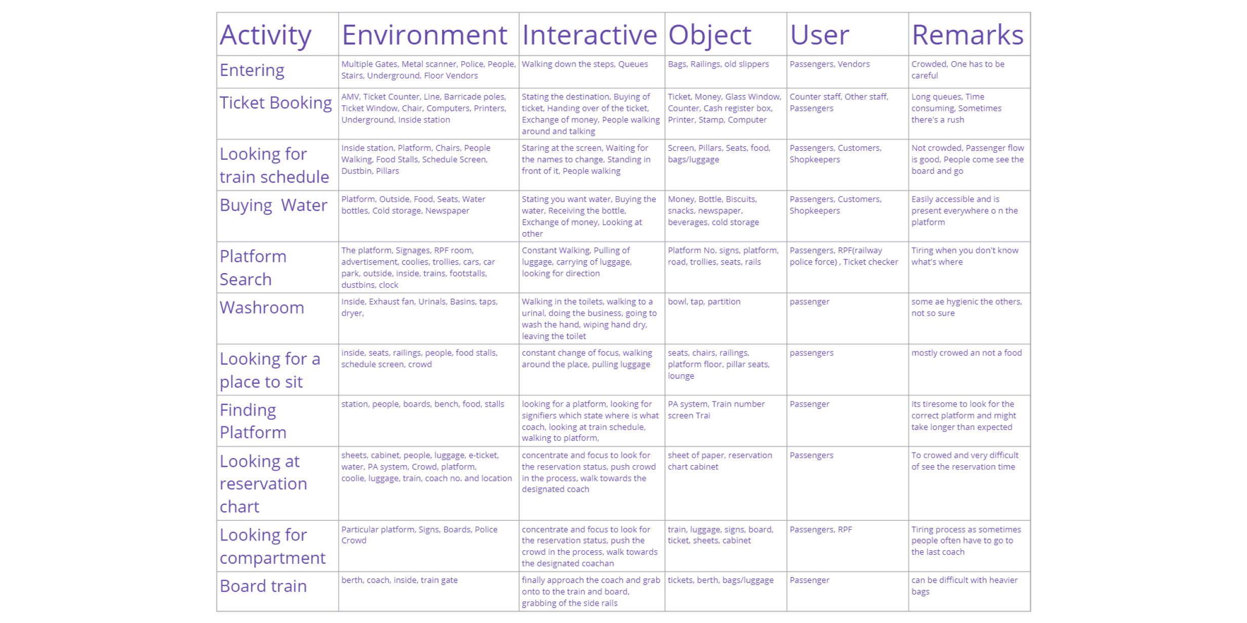
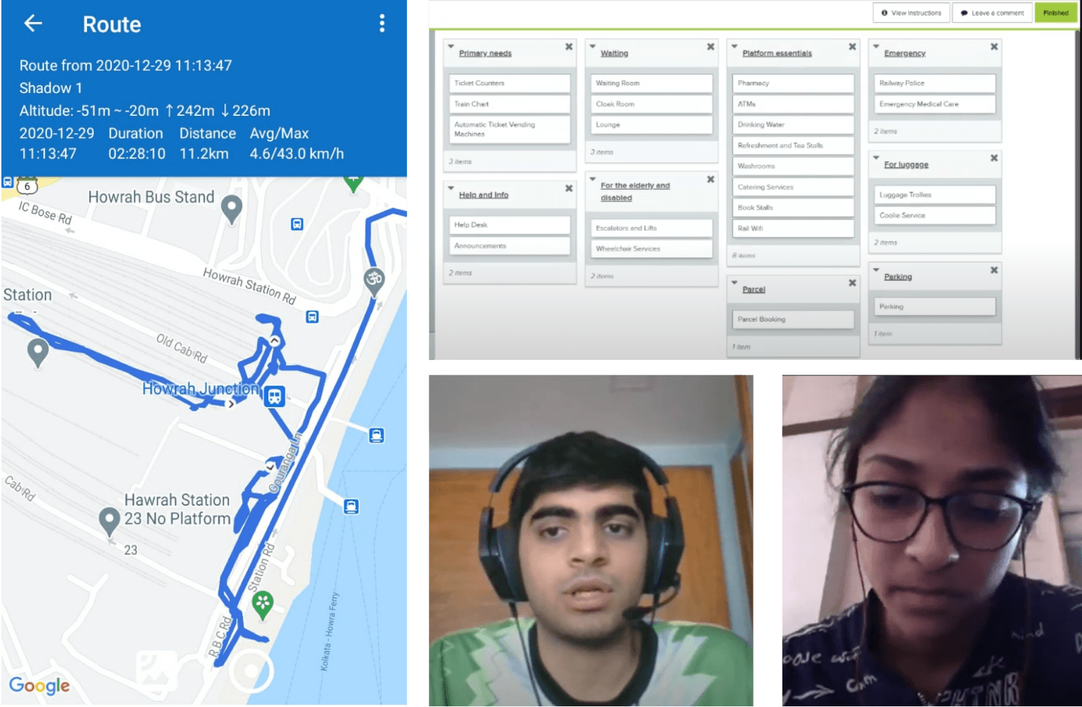
First, we started with a systems study of the train station followed by a survey and interview session to gauge the current average travel experience while using the railways and the difficulties, challenges and motivations which users face during train travel to hear first hand form our user set. Lastly, to sum up our first hand research we did a shadowing exercise to see the what the average user journey is in the train station before and after boarding a train.
Key Focus Areas
Based on the various research methods we used and after conducting our interviews with our target user groups we concluded on a few specific areas which would then go on to shaping our final concept.
What are the challenges faced by travellers on a train station
What’s important for a way-finding app
What are the signifiers and facilities available at a train station
How easy is it to locate the correct platform, get on the correct coach of the train
How comfortable is it to interact with a mobile phone with luggage and continuous walking
Persona
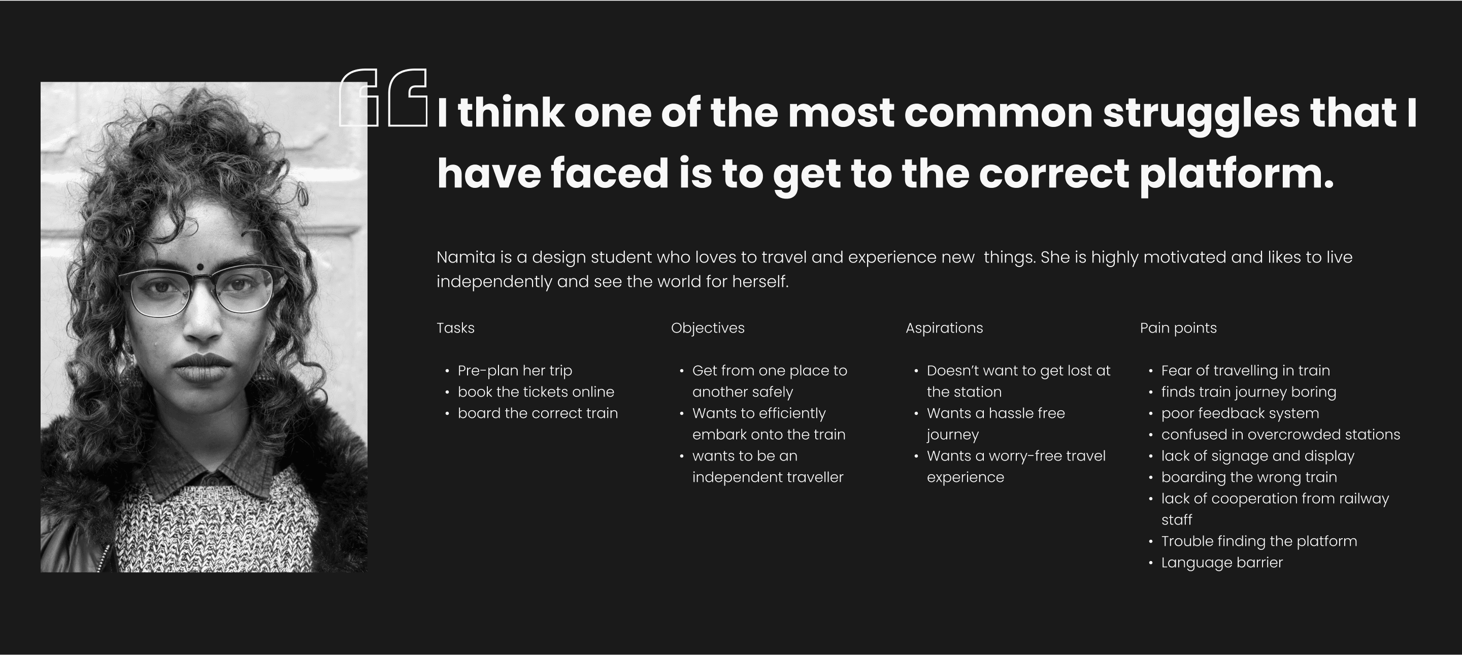
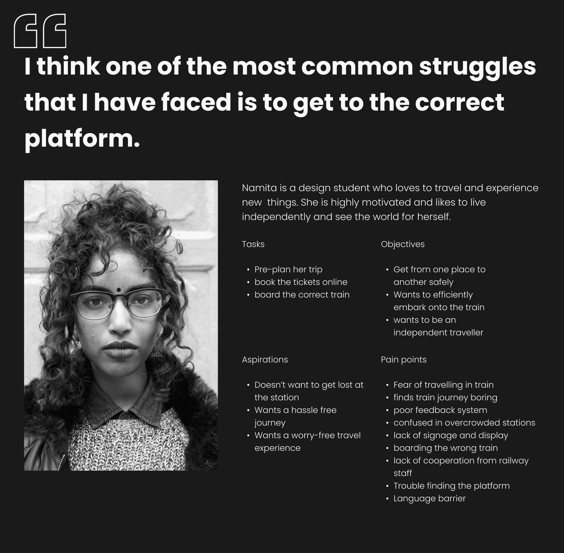
The persona was conceived as a culmination of our research insights, providing us with a comprehensive understanding of the fundamental needs of our primary customers.
Core Customer Needs
I need assistance
Some of the user frustrations are seen when they are getting late for their train or are at a new station. With poor signifier system and lesser sense of direction in a crowded area, travellers tend to have a very exhausting experience with no time to relax.
We conducted a card sorting exercise to figure out what is important for the users in the app for way-finding whilst making their way to the train.
Reaching my train
The most important thing about train travel is to actually board the train. Whether it’s the first or the thousandth time travelling by train, people are always worrying about boarding the train. Unlike an airplane, people definitely can easily miss their trains. One may never know for how long the train will be at halt unless it’s a big junction or the end of the line.
With only the signifiers to look at for way-finding, travellers need a more reliable way of getting around than luck.
It better be worth the space
Users are protective about their storage space and regularly delete apps that they deem not useful. Especially when you are travelling for vacation when one tends to take a lot of pictures.
Product is key
Whether it is to get to the train or find the nearest washroom. It is important that the app helps with the core needs of the users and is intuitive and easy to use.
Once we had listed down our core customer needs then the next step was to develop our ideas and insights to identify opportunities, develop features for the concept.
User Flow
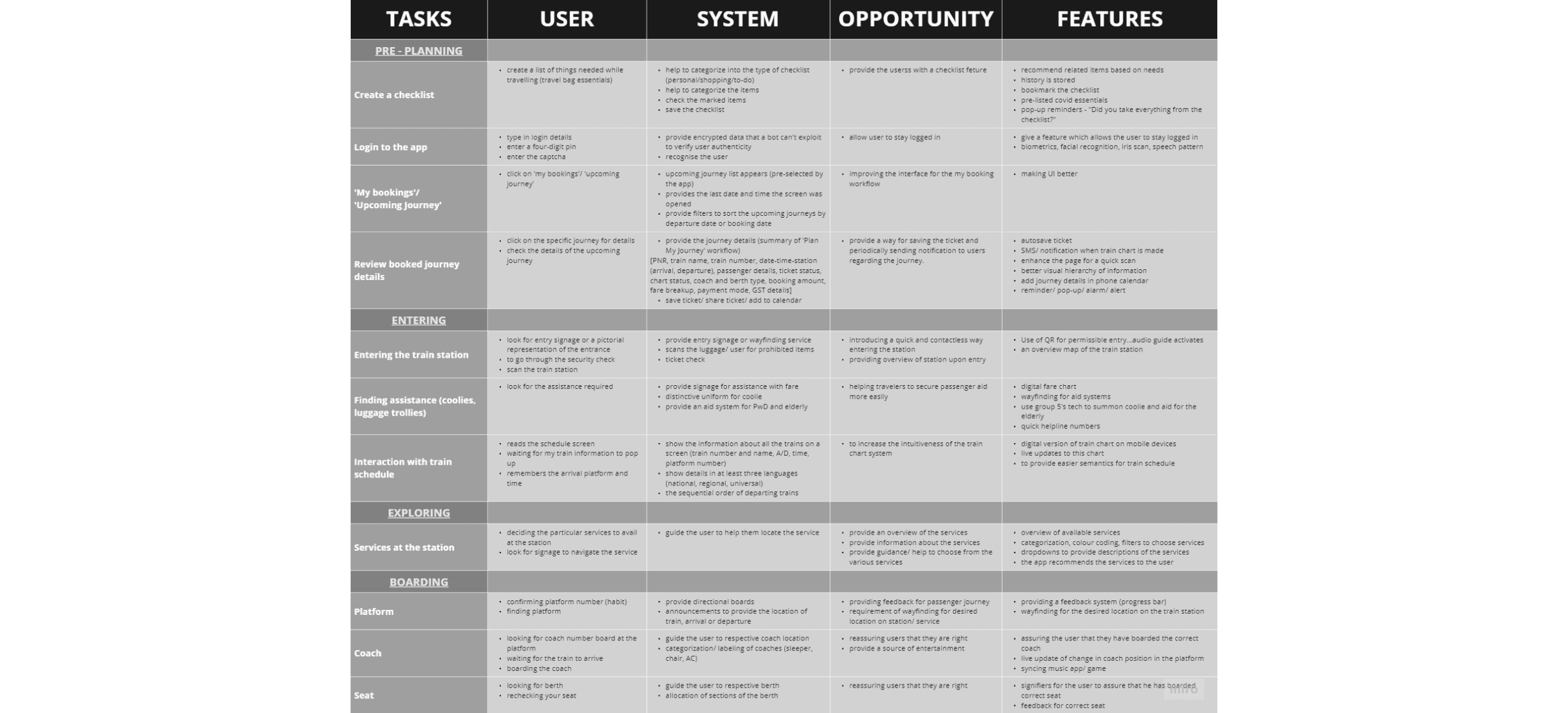
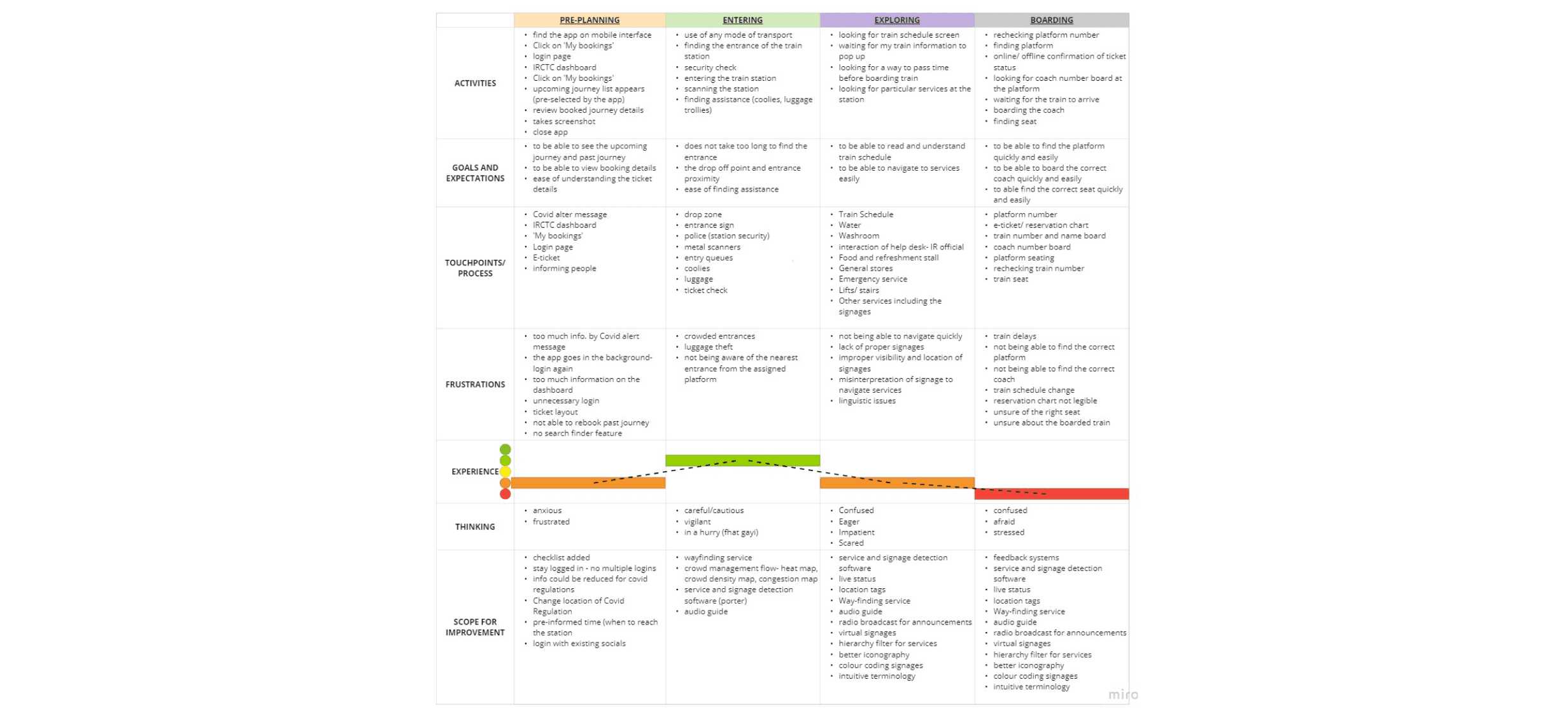
Through the strategic integration of shadowing activities, persona development, task allocation matrix, and user journey mapping, we successfully crafted our primary user flow. This approach ensured an optimal alignment with the core needs of our customers, maximizing effectiveness in our design and implementation.
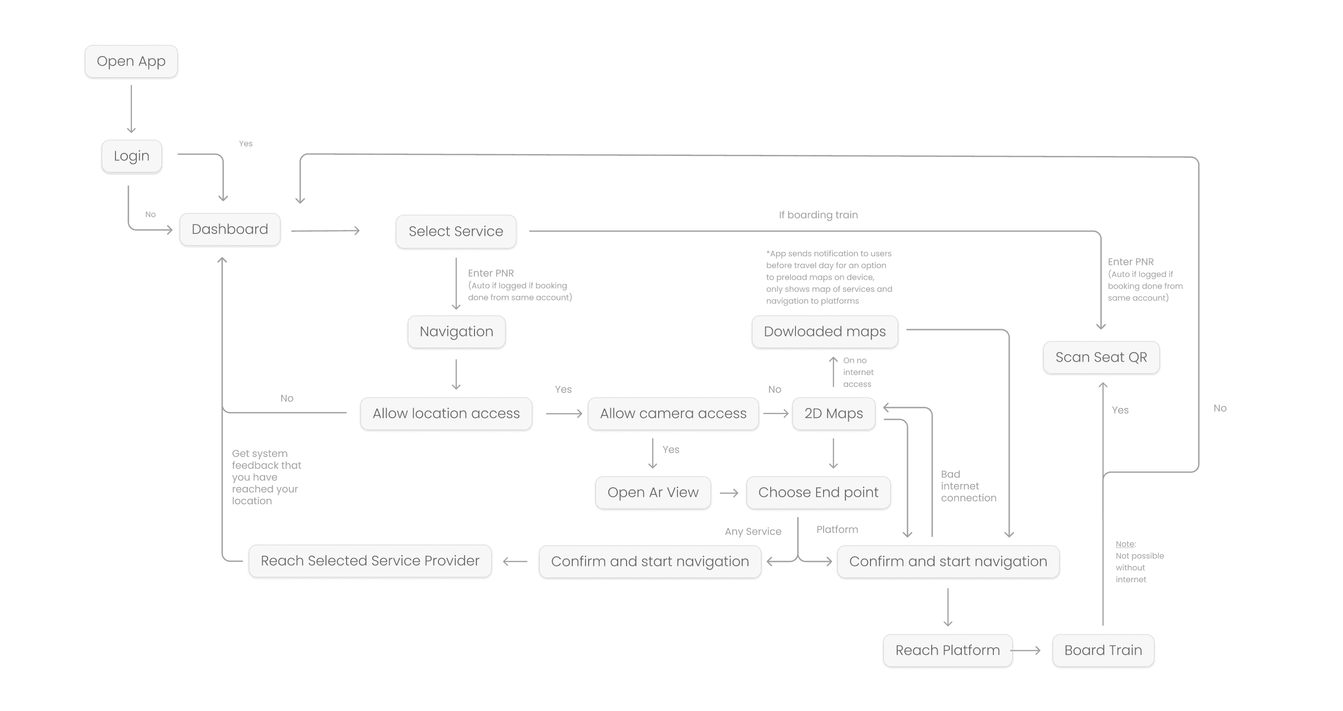
Leveraging the insights gleaned from our User flow map, card sorting activities, and task allocation matrix provided a robust foundation for advancing into the feature-building phase and ideation of our product.
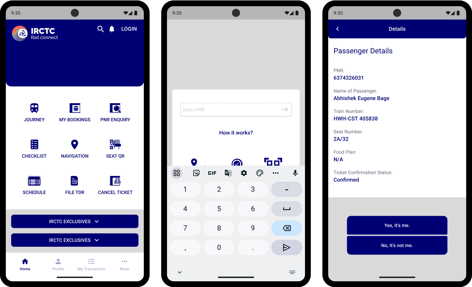
Fetching Details
Redesigning the home page of IRCTC rail connect app for consistency and familiarity. Leading user to PNR entry page for fetching details easily and explaining how way-finding navigation works.
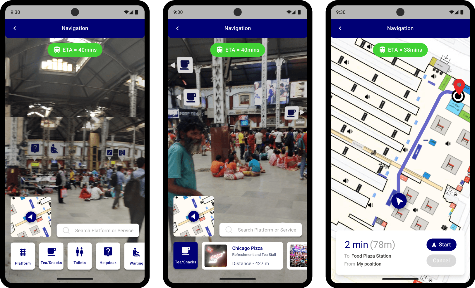
Navigation
Being a new way of looking at a place with AR, a simple landing page was designed with an ETA of designated train based on the PNR data. The iconography was designed to be seen and understood easily to minimize reaction time during navigation.
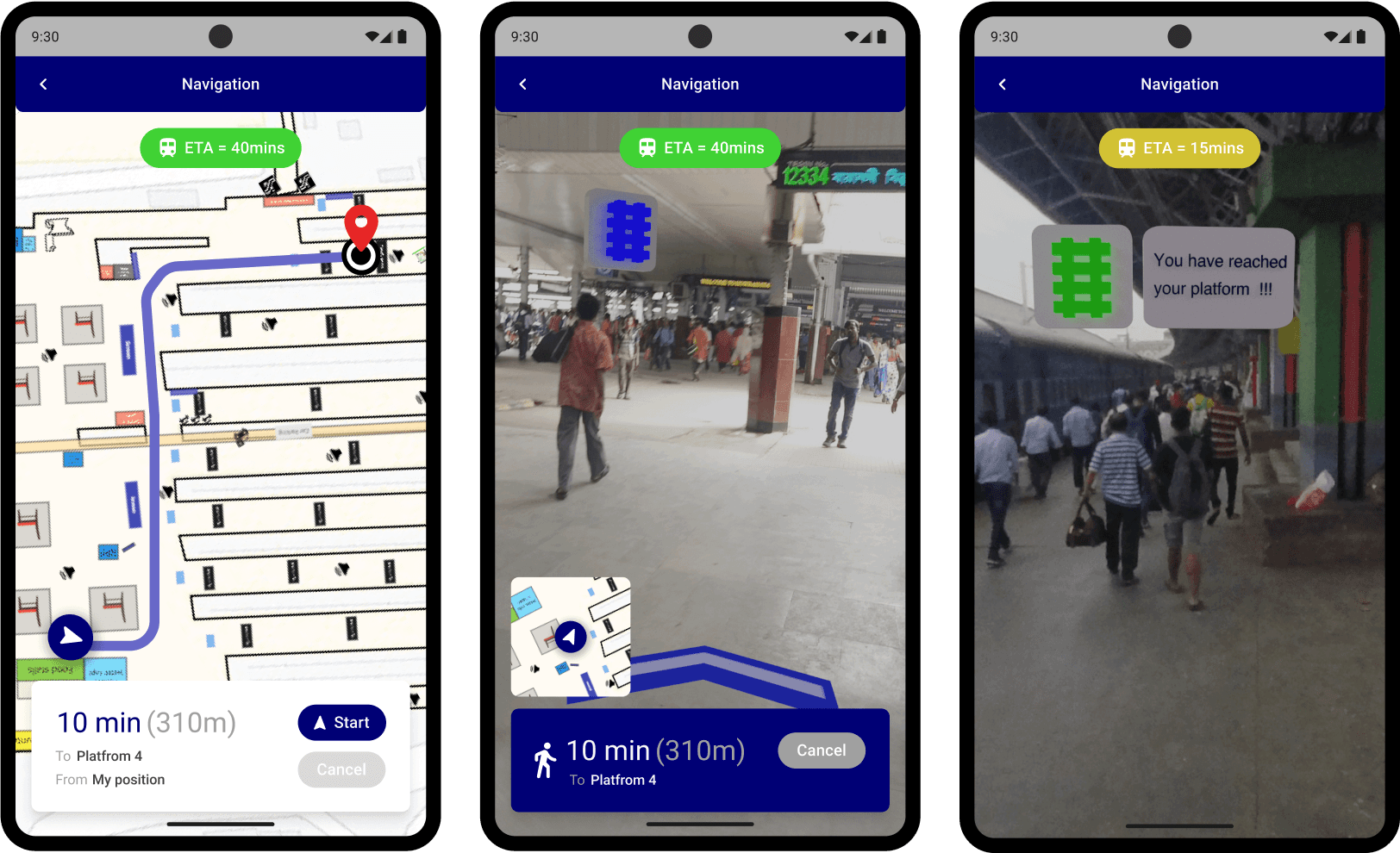
Reach the Platform
Navigate through the train station like never before. Forget getting lost or missing your train because of wrong turns and wrong platforms.
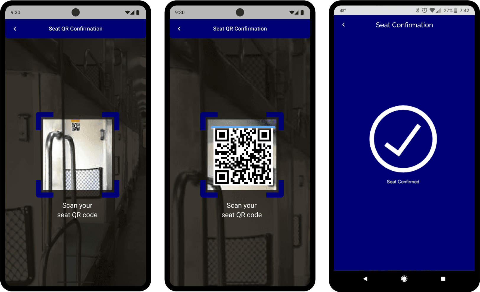
Scan for confirming boarding status
Quickly scan the QR codes of the seats for a hassle free confirmation of onboarding and occupancy of the seat.
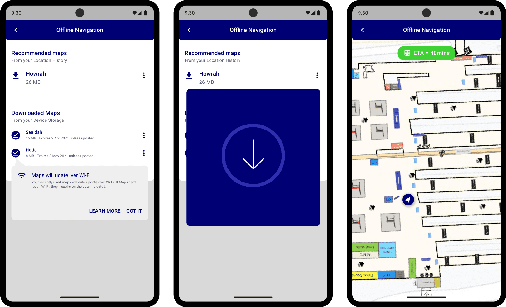
2D maps
Don’t wanna use the AR feature for navigation due to network issues or other reasons? No problem, you can the 2D maps of the place to get to your destination. Maps can also be downloaded prior to travel.
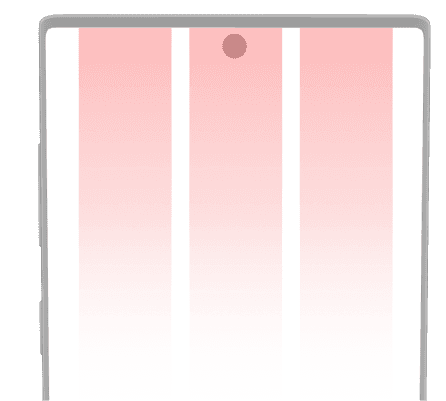
Mobile Grid
411 x 823px
Type Stretched
Column width 105px
3 Column
Margin 30px
Gutter width 20px
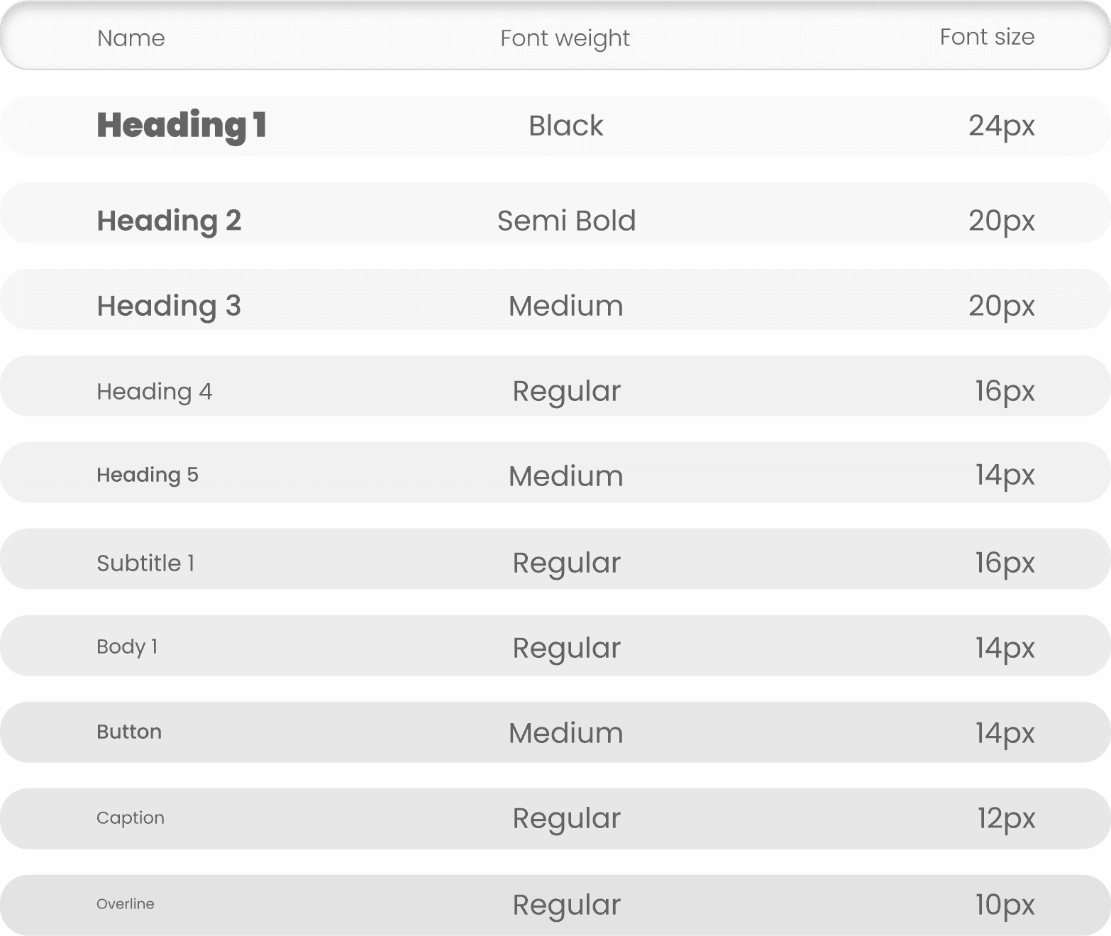
Typography
It is a display face and features both old style and lining numerals, standard and discretionary ligatures, a pretty complete set of diacritics, as well as a stylistic alternate inspired by more geometric sans-serif typefaces than its neo-grotesque inspired default character set.
Roboto has a dual nature. It has a mechanical skeleton and the forms are largely geometric. At the same time, the font features friendly and open curves. Roboto allows letters to be settled into their natural width which makes for a more natural reading rhythm more commonly found in humanist and serif types.
Team
Abhishek Eugene Bage, Shristi TIjaria, Tejas Pawar
My role was of the team lead in this project. I was responsible for the shadowing and mapping activity in the preliminary stages of the project. The rest of the project was a collaborative effort and I was responsible for the final UI changes in the concept and design system created after the testing phase.
Learnings
Team Collaborative
This was my first very exhaustive UX design project with introduction to UI Design Systems. I learned how to balance out the strengths and weaknesses of each of my team members to ensure everyone was comfortable with their responsibilities with the product, but also made sure to challenge each of my team members to do something new in order to help them build their skills.
As an organized individual, I learned what it was like to have to be organized while working with the schedules and timelines of my team members. I learned so much about the importance of keeping your team members up to date about scheduling, team meetings, daily check-ins, and project progress throughout the 8 weeks for project duration.
Synthesis of Data
In this project, we executed various ux research and validation methods. Over the course of 8 weeks we interviewed, surveyed and observed numerous people and synthesized the findings into more and more simpler and structed data which allowed us to look at the smallest of the details to be identified for a more user focused design intervention.

